Expression
Imagery & icons
Photography shows real operators in real locations. If it looks like it was shot for a stock library, it isn't ours.
Photography direction
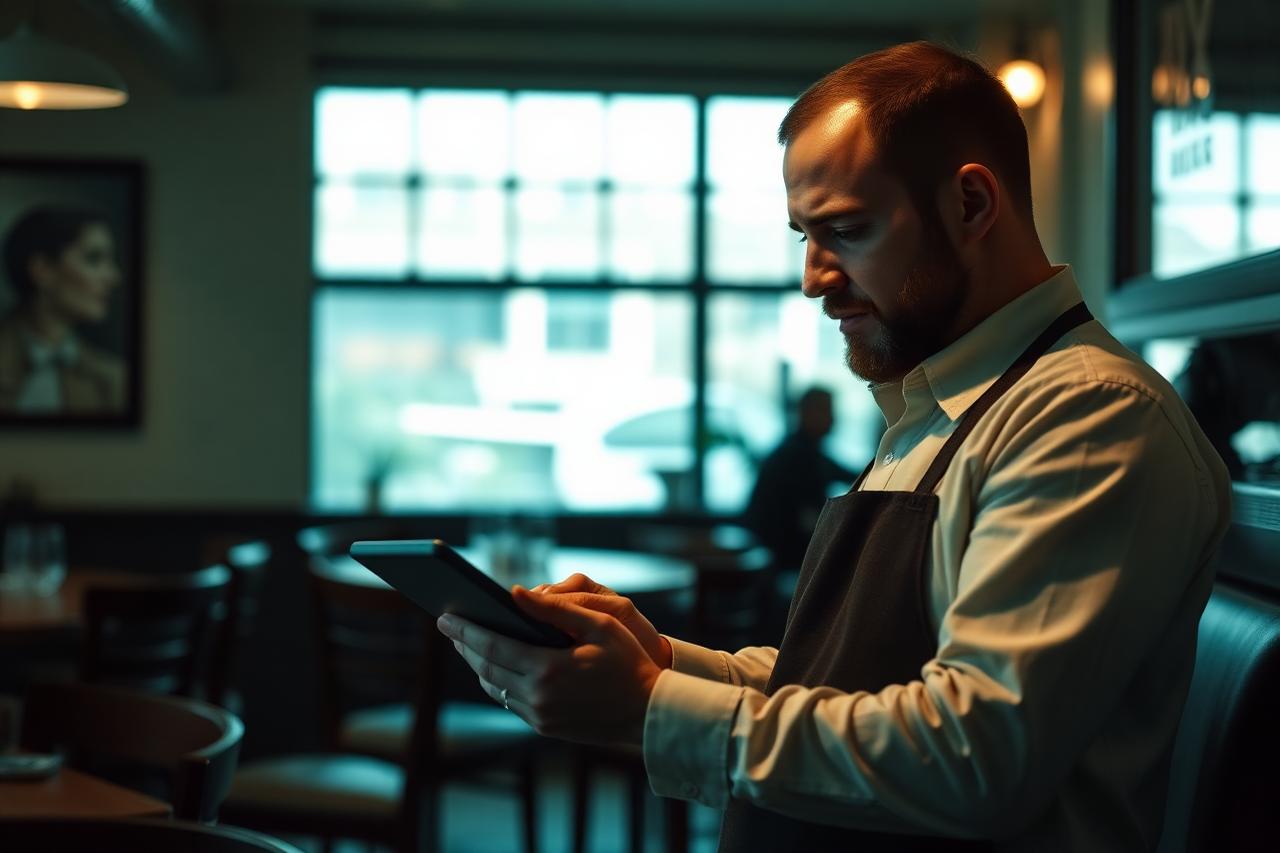


Treatment
Every photo gets the same finish so a mixed grid still reads as one brand.
Grade
Cool teal shift, saturation −15%, shadows pushed toward Ink 900.
Crop
3:2 or 16:9. Leave one quiet quadrant for headline type.
Overlay
Ink at 55–70% when type sits on the image. No blurs, no gradients to color.
Two locations carry the P&L. The other nine coast.
Iconography
Lucide, 1.5px stroke, 24px grid, square caps. Line only. Never filled, never duotone.
Locations
Booked demand
Reporting
Diagnose
Portfolio
Growth
Icons inherit the text color. Cyan is reserved for the single icon that marks the active or winning state.
Rules
Do
- Show real locations, staff and customers, with permission.
- Keep one clear subject per frame.
- Use the ink scrim whenever type crosses an image.
- Use charts and dashboard screenshots as imagery; our data is our best photography.
Don't
- Generic stock: handshakes, high-fives, lightbulbs, rocket ships, growth arrows over cityscapes.
- Heavy filters, vignettes, drop shadows or fake bokeh.
- Photos of competitor brands or unlicensed client locations.
- Illustration styles. We don't have one, don't invent one.